If you’re reading this article, you’re probably determined to either create a new website or update your existing one.
There are many elements to consider when it comes to creating an engaging website with impactful design elements. The first question to ask: What do you expect to see as a user when you visit a digital agency’s website? Naturally, you would want to learn about the services provided, and get a sense of the agency’s mission, and priorities. That is, to find the information you need, the website you’re visiting should be well-organized and user-friendly.
Of course, no one would like to navigate a dull, text-heavy website, right? In recent years, boring websites have given way to witty designs that emphasize the personality and spirit of digital businesses. Inventive concepts took off, and great, creative works appeared. Proving your digital expertise with an aesthetically pleasing twist is always a good idea, especially for digital marketing agencies, as their website is the best place to showcase their work.
Needless to say, innovative, creative, and interactive digital agency website designs attract the attention of users, and today, digital marketing agencies increasingly prefer animated, interactive yet informative websites to show their abilities.
To prove the point we collected 17 greatly designed websites of digital marketing agencies with different expertise and looked closely to see what they did best. Let’s dive in!
17 Best Digital Agency Websites by the Service
Top Full-Service Digital Marketing Agency Websites
Self-expression in the digital creative world proved extremely important, especially among digital agencies where competition is intense. The following four agencies are some of our favorite agencies providing full service.
Major Tom
Major Tom combines the top-level strategy and established consultancy with implementation and technological capabilities to bring clarity to their clients. Incorporating only a few strong images into the white background, Major Tom’s website manages to have a visually appealing but straightforward website design. It’s super simple, yet effective, and created in a way that a client would find what they need in under one minute. Don’t believe us, try it yourself.
Pound & Grain
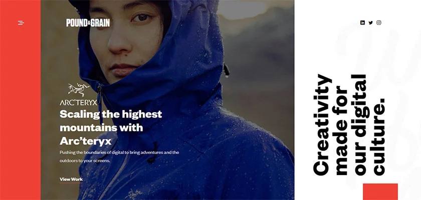
Pound & Grain is original, fearless, and independent. The agency stands out with its distinctive and adventurous landing page. They strive for a digital marketing world in which they can deliver the ideal message to the ideal target audience at the right time.
They use powerful design to guide the visitor and bold color choices like the coral, and orangy red they used in their menu, they seem to be doing a great job in that. Also, displaying the content in square-shaped images creates a neat interface and gives an organized feeling.
Pastilla
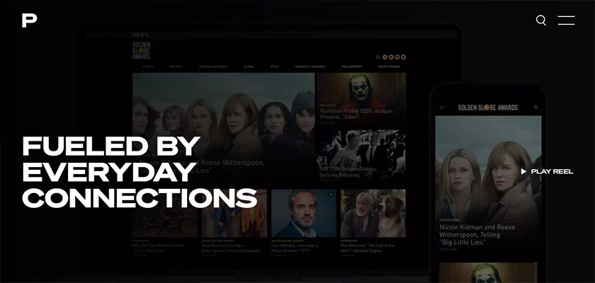
Pastilla is a full-service digital agency based in California where creative instinct meets proven experience. Pastilla’s comprehensive approach leverages data and creative storytelling. They reflect their proven experience in their web design too. The agency’s motto, “Fueled by everyday connections” welcomes you on the homepage. Opening with everyday life video footage, Pastilla uses its showreel to grab your attention in the first three seconds.
The mix of the professional-looking dark theme and the easy-to-navigate website makes it one of the best digital marketing agency websites.
Mimosa Agency
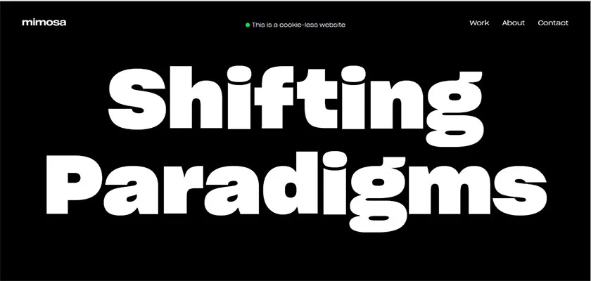
When done right, black & white can be super striking and unique, and Mimosa Agency did something right. They used, if you will, massive visuals that many of us don’t see very often. However, the way large images are presented is so distinctive, and they are displayed so well that it looks very charismatic.
As well, typography and vibrant visuals swap places as you scroll down, creating another dimension. Would it be too much to assume that Mimosa Agency may have designed their website based on the principle of ‘less talk, more work’’? Because at first glance and throughout the site, the frequency of text is rather less than images, and they present their work to the user as they are.
Best Web Design Agency Websites
Below we have listed great examples of website designs that belong to successful web design agencies. Continue reading if you want to develop the website of your dreams for your business and are looking for website builder software or a web design agency to assist you.
Isadora Agency

Isadora Agency is an award-winning digital web design agency that is focused on transformational business web, digital, and marketing solutions. The website of the agency is equipped with purple tones, and once you enter the site, a square element that looks nothing like the standard play buttons welcomes you. You can learn more about the agency by watching a brief video when you click the green square. Such videos can occasionally be far more beneficial for the user than browsing the website. Maybe you can consider adding a short video to your website about your business as well!
Instead of a blog section, the “insights” section expands on subjects related to creativity, inspiration, strategy, and technology and shows how these concepts serve their customers. The Los Angeles-based agency produces distinctive digital solutions including branding, eCommerce, and digital marketing.
Massive Media

Massive Media is an independent branding and web design agency based in Vancouver. Texts are again, used less on the homepage of Massive Media’s website giving way to the images of the projects accomplished and providing a generally satisfying user experience.
You can easily access other pages since each component is featured on the top right header making it easy to navigate throughout the website. The page titled “Our Work” is one of our favorites. Despite the intensity of the images and projects being shown, the use of white space is really effective, and everything is presented in an approachable manner.
eDesign Interactive

eDesign Interactive is a creative digital agency passionate about storytelling, visual design, and technology. The team helps companies worldwide to engage their audiences and build brand recognition. This New Jersey-based, internationally recognized creative website design agency grabs viewers’ attention with its stunning 3D animations and distinctive motion graphics. Their website undoubtedly exudes positive energy.
Vibrant and amusing animations welcome visitors, and the agency did a fantastic job creatively and entertainingly showcasing their work, encouraging you to click.
Creative Brand Design
An award-winning London-based web design agency, Creative Brand Design, is committed to creating high-performance web experiences that excite and inspire. Creative Brand Design has an established and dedicated team with over a decade of experience providing custom and effective web design and development services.

One of the first things you immediately notice on their homepage is their interactive design. The website has dynamic elements including icon animation, 3D parallax hover effects, engaging video/media content, and particle animation. If you navigate through their portfolio, there is a media-rich grid layout of mock-ups and videos of their projects; the individual portfolio pages are equally engaging with scroll effects and interactive visuals.
Flightpath

New York-based web design agency Flightpath creates experiences that connect on a human “difference-making” level to make a true impression. They are discovering compelling insights into human nature, and the real client value begins from here.
Animations that combine creativity and humanity at some point spread throughout every page of their site. Their homepage is simple and elegant and their website contributed to agencies with Flightpath’s artistic designs and experiences. The feeling of creativity can be perceived in every corner of the digital agency’s website.
Bleech

Berlin-based web development agency Bleech is focused on creating quality WordPress websites. The combination of cold blue and green tones draws your attention as soon as you enter the agency’s website. You can definitely get a distinct spring/winter vibe while browsing.
When looking at the Homepage, we can see that the grid layout of the images is displayed as a cool collage. And the website includes a lot of white space, which does not make the user feel overwhelmed at all.
Top Design and Technology Agency Websites
When design and technology come together, we believe the following website designs appear.
Beyond
You can immediately sense the positive energy radiating from the Beyond website and the animated typography is what catches the eye: Beyond is a design company. As you browse, you can see that the texts are presented in a concise form and are found in many parts of the website. Also, the fact that a white background was preferred on the homepage provided a very clean appearance.
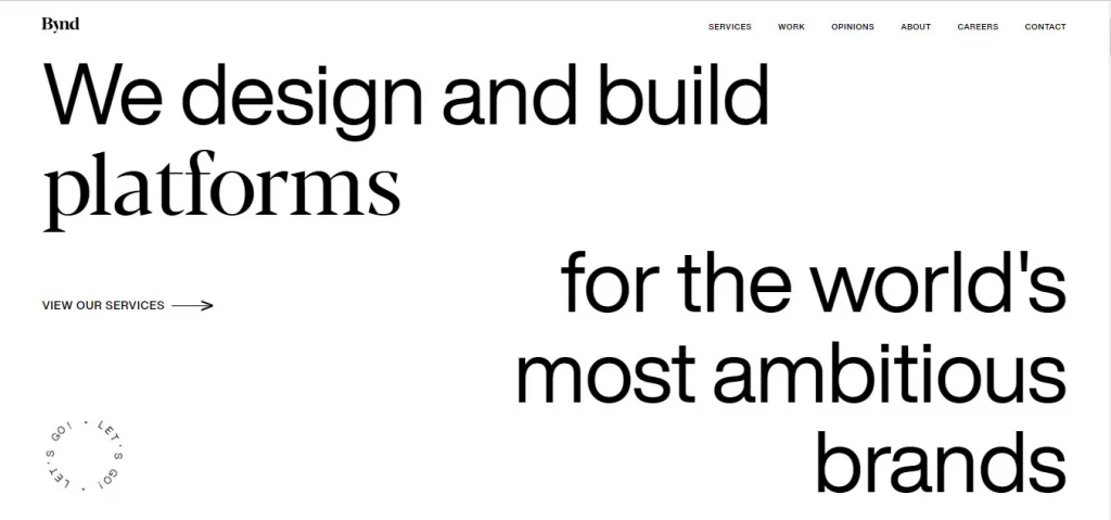
Although the colors and fonts have a retro vibe, it is clear that a young and dynamic team is responsible for all of this successful work. On their website, animated typography and CTA buttons with various designs can be found. As you scroll down, interactive elements start to appear. For example, when you scroll your mouse, the images in the “Recent Work” area on the Homepage begin to slide to the left, enhancing the user experience. The sizes of the images used in this area and throughout the site are different and some of the images are designed with geometric elements of different dimensions. However, this contrast creates a definite unity.
Luminary

Australia-based Luminary is a well-recognized agency with a long history. Their expertise ranges from digital transformation and user experience design to digital marketing and managed cloud services. Luminary’s homepage is full of bright dots that refer to the agency’s name. A CTA button right underneath the colorful dots takes us to a brief video introducing Luminary. As we mentioned earlier, short introductory videos make it quite simple for you to quickly form an opinion on the agency.
Other CTA buttons on the homepage direct users to additional pages with simple descriptions. Rather than overwhelming the user with text, the website is set up so that you may find information if it interests you. We can say that the website’s Top Bar menu was that which we favored the most. As a result of the titles being listed in bold at the top left and fixed with a drop-down menu, it seems like it can capture the attention of potential customers easily. We believe that the website of the Luminary Agency serves as an example of a website that has an attractive design and makes it easy to find what you’re looking for.
RNO1
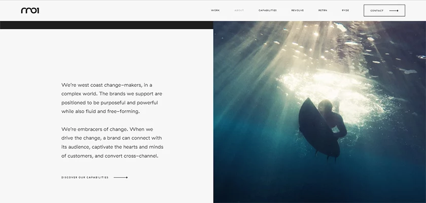
Can a website make you want to swim in the ocean? Our answer is yes. RNO1’s website, consisting of cold tones of blue and turquoise, creates a general sense of peace for the user. The case studies on the home page have rectangular designs, and when you click on one of the images, the image begins to move, giving the impression that a stone has been thrown into still water. The site generally exhibits the wave effect.
The California-based agency helps brands to shape connective experiences, both online and offline. They also define themselves as ‘embracers of change.’’ Moreover, they won Best UX Design, UI Design, and Best Innovation awards with this relaxing, cool website.
Engine Digital
Engine Digital is an NYC and Vancouver-based digital agency focused on improving the way organizations reach and connect with users. They help their clients deploy digital platforms, services, and products, from concept and ideation to a methodical approach to design and engineering. Their own website is just a perfect example of this approach. The site sets a high value on the use of white space. And two words are enough to sum up the experience in general: sleek and professional.
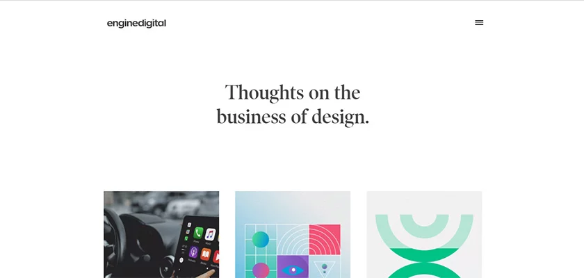
Engine Digital avoids the use of heavy visuals, using them sparing and combining them with short texts and small agency-specific elements. Quality visuals were used to break the monotony the whitespace might create and as a result, the visitors get to the core of their services without being overwhelmed by the design.
Frank Digital

Frank is an award-winning digital agency combining strategy, creativity, and technology to deliver beautiful digital experiences across all channels and devices. Frank Digital’s website also opens with an energetic showreel that highlights the motto “Experience Beautiful” and you can scroll down to discover more about the agency’s case studies as well as the blog posts.
They made the most out of a rectangular design and used the website space super effectively yet beautifully to convey their message. Some of the images turn into videos and go into the background while informative texts hover on them. This dynamic style helps maximize the use of space without crowding it with design elements.

Top Creative Digital Agency Websites
We’d like to conclude this selection with two “Creative Digital Agency” websites, which we believe live up to their word in the best way they can. Don’t start designing yours without checking their websites.
Crowd
Crowd is an independent global marketing agency that values diversity and sustainability with offices in many locations such as Australia, China, the Netherlands, Spain, UAE, the UK, and the USA. Their website welcomes you with an exciting introductory video that includes shots from the agency’s remarkable works. Don’t forget to unmute the video as it has an energetic beat that supports the great shots flashing throughout the reel.

The agency’s trademark orange is used to direct the visitor inside the website and also emphasize the important stuff such as contact forms and other CTA buttons. The website is easy to navigate, and the information is not hidden somewhere in the footer. It’s all right before your eyes. We can say that Crowd knows that you don’t have time to excavate important information from a “crowded” website. And they give you what you need with good design.
Vrrb
Like to scroll? Verb website offers a great scrolling experience while displaying information with a game-y feel to it. Soft colors, a hollow circle pointer, and moving text make you feel like you are changing terrains every time you scroll. Vrrb is a Los Angeles-based digital agency that builds top-notch websites and mobile apps. They work with a wide spectrum of clients, from innovative startups to global enterprises.
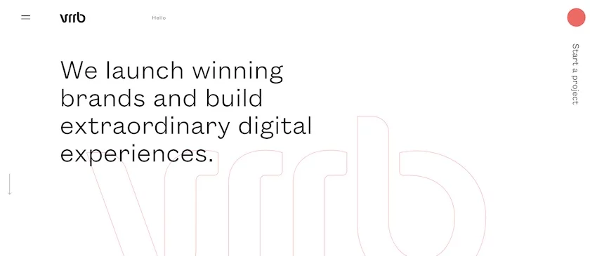
Vrrb uses different design elements in each section and uses bold close-ups, flowing text, and typography choices with character. In short, Vrrb’s website is cool and unpredictable. All in all, their website ensures that you get great design when you work with them.
There you have it – some creative and inspiring digital marketing agency website design examples you can truly leverage to create a visually appealing, highly readable, and relevant website for your marketing agency.
We also listed the best web design tools for agencies and the best web design agencies for startups that may help you with further reading.
Read the full article here


