‘’Meet the team’’ page’ is one of the most important parts of your agency website proving that there is a team behind the work you do, as well as showing what position the employees work in and who the users need to communicate with.
Most importantly, it allows you to take a more sincere stance by giving users or potential customers an idea about your agency.
What Makes a Great “Meet Our Team” Page?
The main purpose of the Meet the Team page is always to show the users what kind of a team you are. It is up to you what exactly you aim for when creating such a page; however, keep in mind that these pages definitely help you to build a connection with your audience!
About Us or Meet the Team pages allow you to interact with users who visit your website; thus, apart from the work you do and the services you offer, it helps to establish a more realistic communication while revealing the fact that there is a team behind all the hard work.
Add a personal touch to your page
“About Us” and “Team” pages are usually the first places that visitors look at. Therefore, they are an important part of the overall web design of your website. So, you should use quality images or graphics that highlight your team and express your agency’s profile. Also, use an appealing design that suits your company; design thinking helps marketers to boost customer engagement with greater empathy.
Furthermore, demonstrating your employees and their responsibilities would be useful as seeing the talents of your team might be something your visitors are looking for.
Optionally, you can include the links to their social profiles, websites, or blogs and you can use organizational charts if you have a large company as well.
Last but not least, creating a “meet our team” page expresses your company’s identity. While creating your company a personality, you are also increasing brand awareness and certainly, this is something that helps your brand to grow.
Inspiring “Meet The Team Page” Examples by Digital Agencies
We have listed a few digital marketing agencies that created amazing “meet the team” pages. Now, let’s find out what are these agencies doing right! Below are the agencies we have selected for inspiration.
Luminary
When we first enter the meet the team page of Luminary, a showreel video about them welcomes the user. In this short video, they fit some of the agency employees, the services they provide, and the customers they provide this service to. This short video gives the impression that the Luminary agency is well-established and experienced at first glance. In addition to this video, the agency also included a small detail on the About page, explaining the meaning of its brand name. It is a minor but crucial detail! If your brand’s name is unique or has a special meaning for you, you may want to consider sharing it with your users or customers as well.
Luminary describes its employees as “digital warriors” and includes all of them under the heading Our People, accompanied by high-quality visuals. While the pleasant and entertaining poses of all employees attract the attention of the user, they definitely spread positive energy to the agency’s website. Luminary has been creating award-winning digital experiences since 1999 and they mainly specialize in large-scale projects implemented with Kentico, Episerver, Sitecore & Umbraco.
RNO1
RNO1 is a west coast brand and digital experience agency headquartered in California. Their motto is “Together, we can make waves.” Therefore, RNO1 has a beautiful, ocean-themed website with soft colors. The agency’s meet the team page has a very calming and serene design. Brief information about the agency is given and they also list very minimally to whom they provide service. The team photos that appear when we scroll down have a very minimal design that does not tire the eyes. But when you hover over the team photos, the background color of the photos changes and turns into a different pastel color for each employee. This adds color and interaction to RNO1’s soothing Team page. The “ocean wave” detail while hovering over the image is also a gentle touch.
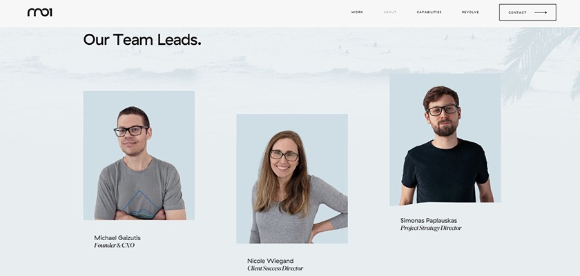
Professional photoshoots completely change the mood of the team page and will definitely help you take your page to the next level. If you’re not sure how to display your team images, you can set up a professional photo shoot day at the office!
Major Tom
Major Tom is a full-service digital agency that combines top-level strategy with implementation and technological capabilities. Their homepage creates a remarkable impression because of its parallax scrolling design. It has a character and visuality that reflects the agency. The same goes for their ‘’meet the team’’ page. A short but to-the-point page explains Major Tom’s approach and showcases the team.

Retro illustrations are featured throughout the site. They have a very simple and easy-on-the-eyes About Us page. They both explain why you would want to work with Major Tom and allow you to meet core team members.
Massive Media
Massive Media is an independent branding and experience design agency. Their services have a great variety, such as branding, digital marketing, web design etc. The Vancouver-based agency has a modern and elegant website with great visuals. Its About Us page is positioned on a black background. Throughout the page, there is a lot of important information not only about the team members but also about the agency, such as the services provided by Massive Media and their core values. This page, unlike many other agency websites, is brought together under the title Agency.
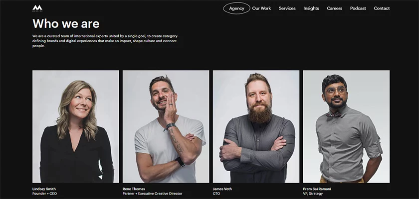
They briefly mentioned the 4 rules that are important to them, and when we scroll down, the Our Team section appears. We loved how these team pictures are so professional looking! They have appropriately positioned which team member is who and, this Our Team section, which is not like the classic team photos that we can even describe as “boring”, has a very special place.
The agency’s dog, Onyx, is also included in the team visuals, and his title is “Chief Barking Officer. ” How cute is that?
KOTA
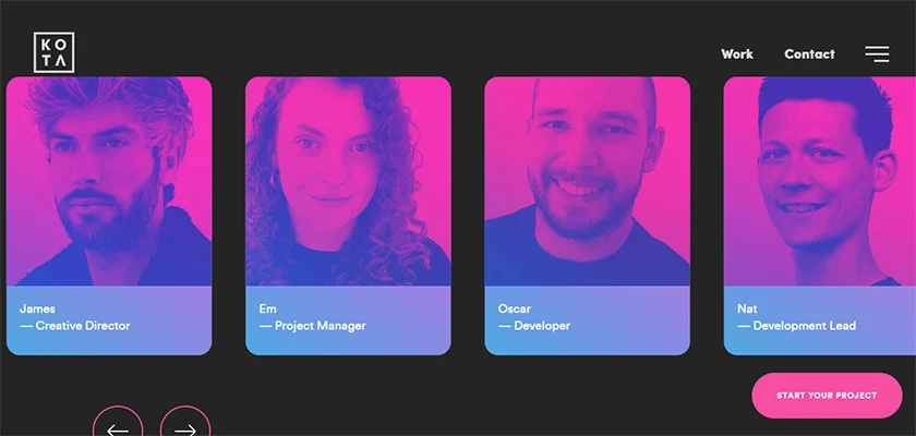
KOTA is a digital creative agency based in London and New York. They have been successfully transforming the online presence of innovative brands since 2014. Their team is made up of creatives with technical know-how, strategists who think outside the box, and developers who push innovation. The team page, where neon blue and pink colors, that is, the basic colors of the KOTA agency, are used intensely, gives the user a pleasant UX experience. When you enter the agency page, you are greeted by a few words in which the agency briefly expresses itself, and then a pleasant video under the title Our Studio. With this video, users have the opportunity to see the work that the KOTA agency has done, along with the chance to take a small look at the office environment. Afterward, seeing the team having fun together not only in the office but also outside their work environment makes you feel much closer to them.
Finally, we see team images based on neon blue-pink colors. The Agency page revealing that KOTA consists of a small but dynamic team is one of the most creative and entertaining pages we have seen.
Bleech
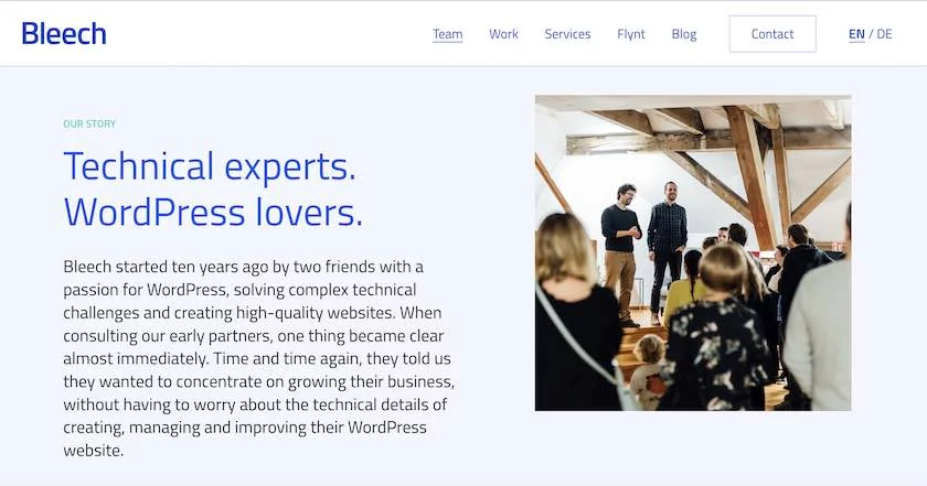
Bleech is a web development agency coding quality WordPress websites. Their solutions are based on a modular system which makes it simple to maintain and easy to extend. The agency information of Bleech is gathered under the title Team and users encounter a short and concise explanation of how they define themselves. The team at Bleech defines themselves as Problem-solvers, Technical-Thinkers, and WordPress-Lovers. As you scroll down, you have the opportunity to take a look at the pleasant working environment in the office.
The Team page follows the same color scheme as the website, which is driven by blue tones, the primary color of the agency. You may find the agency’s values and objectives by reading further into the website, which also contains a brief history of how and why the company came to be.
Redonk Marketing
Redonk Marketing is a digital agency focused on creating user experiences that build brands, deepen customer relationships and grow businesses. The Texas-based agency opted for a simple and friendly meet-the-team page titled “Who We Are”. Firstly, a few explanations had been displayed on the culture and perspective of Redonk. They explain their business approach before showcasing the people. The team portraits have titles and short introductions including a fun fact about the team member. The Team page of the website, where green color tones are used predominantly, also adds a very earthy atmosphere thanks to its lush and white background. Although team images may seem plain at first glance when you hover over the pictures, they change shape and funny pictures of team members appear.

Redonk, perhaps has one of the most entertaining agency names we have listed so far. They also have very humorous quotes throughout their website as well as their team page.
Search & Gather
Toronto-based digital marketing agency Search & Gather is focused on paid search (PPC), paid social, and conversion (landing page optimization). When Search & Gather set out, they were an enthusiastic small team of 5, as they stated on their meet our team page. The page has amusing images of the core team working from one of the team members’ apartments while they still lacked an office. The main highlight of this page is the way Search & Gather describes how they have developed as a team and their early experiences. In a really sincere and welcoming way, they have given the user the chance to learn more about the agency. The team images are quite awesome and show everyone having fun while they work.
Wrapping Up
A creative meet our team page is a wonderful place to show your agency’s culture and team. Use your creativity while adding personality to this section. For instance, adding videos, using illustrations, or mentioning personal details about your employees will definitely make your brand more memorable.
Moreover, this is a great place to add job postings. So, try to create a professional, fun, and unique page!
Read the full article here


