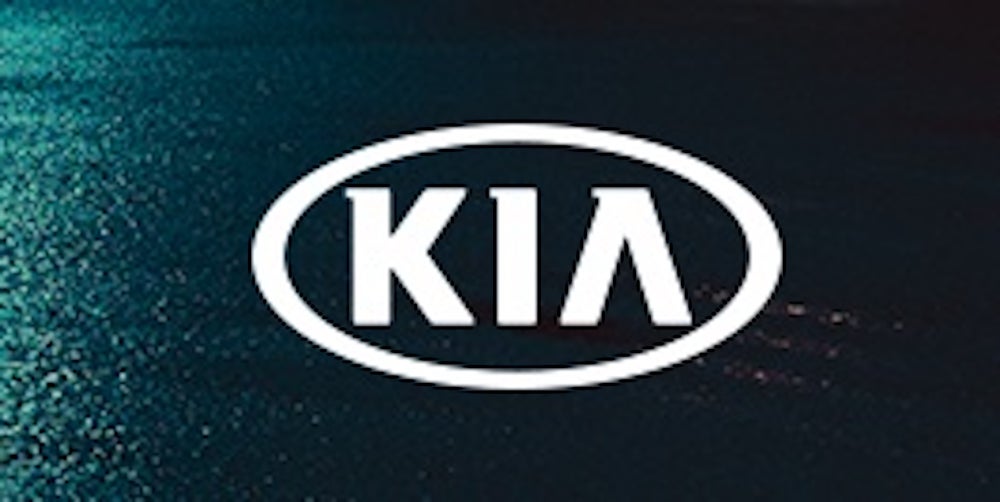
The “KIA” in any other image would probably be less confusing.
In January 2021, car manufacturer Kia redesigned its formerly recognizable circular “KIA” logo, which it had in some format since 1994, to a more stylized depiction of the company’s name.
But the change has absolutely befuddled potential customers, according to The Drive. And it’s not a small number of people, either.
Some 30,000 people have been googling “KN car” every month since the logo’s debut, according to the outlet, noting the increase began when the Kia Stinger hit the market bearing the new logo.
“I just want to emphasize how many people 30,000 actually are. That’s 360,000 people every year, 986 people per day, 41 people per hour, or one person every other minute,” the outlet added.
The new logo was also panned at the time of its release by some industry outlets. But other experts disagree.
Ed Kim, president and chief analyst at research and consulting firm, AutoPacific, told Entrepreneur the search traffic from Kia’s confusing logo might be working in their favor.
“If [the new logo] is noticeable enough to people they’re Googling ‘What is this logo?’ I would make the case the logo is actually doing its job,” he told Entrepreneur.
Twitter user Ashwinn Krishnaswamy first spotted the Googling trend.
Kia was founded in 1944 and is owned by Hyundai Motor Group, which is based in South Korea. After investing more in the cars., the company mounted a remarkable rebrand, going from an entry-level car in the 2000s to now topping vehicle quality studies, Popular Mechanic noted.
The number of Kia and Hyundai vehicles sold in the U.S. has gone up about 61% since 2010, CNBC noted and the company has sold over 1.4 million cars in the U.S. in 2021, per industry data from Cox Automotive, the outlet added.
The company introduced the new logo in January 2021, saying it “[declared] the brand’s future transformation.”
“The rhythmical, unbroken line of the logo conveys Kia’s commitment to bringing moments of inspiration, while its symmetry demonstrates confidence,” the press release added.

The old Kia logo, Courtesy company
But it appears the new logo isn’t resonating with every customer. As The Drive notes, there are multiple Reddit threads on the issue.
In the Reddit forum “R/what is this car” (which is for any “unknown vehicle you’d like identified”) someone posted a Kia with the new logo, and someone wrote, “It’s their new logo.”
“Thanks! I don’t think I’m a fan of it,” the original poster responded. Some users did say they liked it.
Two top-voted comments in another Reddit thread add: “hate it. Every time I see it, I see KN, not Kia,” and, in response, “Same. I had to google KN car logo to figure out what it was. I thought it was some new.” Others in Krishnaswamy’s Twitter mentions have disagreed.
I have to disagree. It’s a beautiful logo. No one thinks there’s a car called KN.
— alistair king (@ALsparkles) November 20, 2022
Saw this on a car the other day and it was completely unreadable. pic.twitter.com/Il0i4GUHIZ
— Steve Dennis (@subcide) November 19, 2022
Kim, for his part, added that he thought the logo change made sense in the context of Kia’s shift to a reliable car and gained more “pricing power,” particularly with the release of the highly-rated Telluride car model in 2019 for the 2020 market. The 2023 Telluride starts at $35,690.
“I do think the logo does fit hand in hand with where the Kia brand is now and where it’s going,” Kim said. “The cars have gotten a lot more appealing and even a lot more upscale,” he added.
The company did not respond to a request for comment.
Read the full article here


